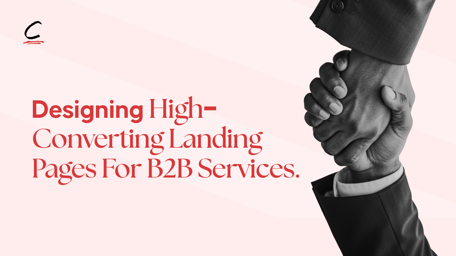
A high-converting B2B landing page works by answering three questions every buyer is silently asking before they book a call: is this relevant to my problem, can I trust these people, and is this worth the risk? It does this through a clear value proposition, focused single-goal messaging, trust signals with measurable proof, strategically placed CTAs, and a structure that guides the prospect from curiosity to action, without overwhelming them or forcing a sale.
Before a B2B buyer ever books a call, they are silently asking those three questions. High-converting B2B landing pages are designed to answer them clearly and confidently. For service-based brands, where decisions are rarely impulsive, the landing page becomes a controlled decision environment, not a marketing afterthought.
This is why designing B2B landing pages for conversion requires strategy, not just design execution. B2B buyers aren't scrolling casually, they're looking for solutions to expensive problems. When landing pages are done right, they guide prospects from curiosity to action with clarity and confidence.

How is designing a B2B landing page different from designing for B2C?
B2B landing pages are fundamentally different from B2C because B2B buyers are deliberate, risk-aware, and often answerable to internal teams or leadership, so the page must prioritise trust, clarity, and proof over emotional triggers or urgency tactics.
B2C pages often rely on discounts, scarcity, or emotional pulls. B2B landing page design must communicate competence, relevance, and outcomes instead. Your audience isn't asking "do I like this?", they're asking "does this service understand my business context, have they solved this problem before, and will choosing them reduce or increase my risk?"
A landing page that fails to address these concerns will struggle to convert, regardless of how polished it looks.
What is the real goal of a B2B service landing page?
The real goal of a B2B service landing page is not traffic or time on page, it's generating qualified leads. Every section of the page should be designed around a single, clearly defined conversion goal: booking a discovery call, requesting a proposal, signing up for a consultation, or accessing a resource that moves the prospect further down the funnel.
Anything that distracts from this goal, excessive navigation, unrelated offers, vague messaging, weakens conversion. A focused landing page helps prospects self-qualify, so that when they take action, they already understand your value and expectations.
What are the core elements of a high-converting B2B landing page?
Five elements consistently appear on B2B landing pages that convert: a clear value proposition, focused single-goal messaging, trust signals that show measurable results, strong and well-placed CTAs, and process transparency. What matters is not just including them, but understanding why they work.
Clear value proposition
Your headline and sub-headline must communicate specific outcomes, not vague promises. "We help companies grow" says nothing. "Reduce enterprise software implementation time from six months to six weeks" says a lot.
The most common mistake is promoting services instead of results. Buyers don't want consulting, design, or strategy, they want to know what those services deliver. Lead with transformation. If a sceptical buyer responds "so what?" to your headline, it isn't clear enough. A strong value proposition makes the benefit immediately obvious: cost savings, risk reduction, speed, or growth.
Focused messaging; one page, one goal
High-converting B2B landing pages resist the urge to say everything. Multiple CTAs, navigation menus, and external links give visitors reasons to postpone decisions. Remove distractions and guide prospects down a single path, no navigation headers or links back to your main site.
The only exception is one secondary CTA for lower-commitment prospects, such as a downloadable resource alongside a primary "Book a Call" action.
Trust signals that actually matter in B2B
Buyers want proof of results, not promises. Strong trust signals include case studies that clearly outline the problem, approach, and measurable outcomes. Industry credentials, certifications, recognised clients, and media features reduce perceived risk. B2B buyers make safer decisions when they can see that others have already validated your expertise.
Process transparency matters too, explaining how you work, what clients can expect, and what deliverables look like builds confidence and removes uncertainty.
Strong, well-placed CTAs
Aggressive CTAs can damage conversion if they feel like too much commitment too early. Many B2B buyers prefer to gather information before speaking directly. Soft CTA options, assessments, guides, or frameworks, let prospects engage at their comfort level while still signaling intent.
When using direct CTAs like "Book a Consultation," reduce friction with reassurance: short calls, no obligation, or fit-first conversations. Effective B2B landing pages repeat CTAs at key moments: above the fold, after explaining value, following social proof, and at the bottom. Prospects convert when they're ready, your job is to make the option always visible.
Read More: 3 Tools You Need To Create Immersive Website Experiences
How should a B2B landing page be structured for conversion?
A high-converting B2B landing page follows five structural sections in order: above-the-fold clarity, problem framing, solution positioning, social proof, and CTA placement. Knowing the right elements is only half the work, conversion happens when those elements are structured intentionally, because in B2B landing page design, order and clarity matter as much as content.

Above the fold: immediate clarity
Visitors decide within seconds whether to stay. Your above-the-fold section must instantly answer three questions: who this is for, what outcome you deliver, and why it matters. This means an outcome-focused headline, a subheadline that explains how you deliver that outcome, and a clear primary CTA.
Visuals should support the message, not decorate it, replace stock imagery with branded pictures, process diagrams, or before-and-after examples that show real work. Where relevant, add a visible trust indicator such as recognised client logos or a concise credibility statement to reduce doubt immediately.
Problem framing
Once attention is secured, acknowledge the specific problem your audience faces. This builds alignment and shows you understand their reality. Avoid generic statements, specific problem framing resonates more strongly because buyers recognise themselves in it. Keep this section concise, enough to establish shared understanding.
Solution positioning
With the problem established, position your service as a strategic solution. Focus on how and why your approach is the best fit, rather than listing features. Briefly explain your work process and what makes it unique, the goal is not to teach the process in full, but to show competence and strategic thinking. Buyers should feel confident you know what you're doing, even without all the details.
Social proof
This is where trust replaces doubt. Strong B2B landing pages lead with proof that shows relevance and results, case studies, quantified outcomes, and testimonials that speak to real business impact. Numbers make success tangible. Where possible, include perspectives from different stakeholders to reflect how B2B buying decisions are made collectively.
CTA placement
Your primary CTA should appear multiple times: above the fold, after social proof, and at the end of the page. Different prospects are ready to convert at different moments. Make CTAs visually prominent and supported by brief value reminders, what the visitor gains by taking action, which shifts the CTA from a request into a clear value exchange.
Read More: 7 Applications Of Interactive Design In Storytelling
What mistakes kill B2B landing page conversions?
The three most common mistakes that kill B2B landing page conversions are information overload, weak positioning that sounds identical to competitors, and using generic templates without tailoring messaging to the specific audience and decision-makers.
While B2B buyers value detail, presenting everything at once overwhelms them, a high-converting landing page prioritises clarity over completeness. Generic promises like "we deliver results" without specifics leave nothing for a buyer to hold onto. And templates provide structure, but conversion only happens when messaging reflects real business needs, real market context, and the specific concerns of actual decision-makers.
When should a B2B service business use a dedicated landing page?
Use a dedicated landing page for paid campaigns, targeted outreach, new service launches, or specific audience segments where you need to control the narrative and remove the distractions a full website introduces.
For B2B service providers, landing pages also act as strategic testing tools. By observing how prospects respond to different messaging, layouts, or CTAs, you gain insight into what resonates most, insights that then inform broader brand and marketing decisions.
The difference between a 3% and a 10% conversion rate is rarely a budget issue or a design problem. It is consistent strategic clarity applied across every section. Every element should move the buyer closer to action, or be removed.
Read More: Website & Branding Agencies Based In London
FAQ
What makes a B2B landing page different from a B2C landing page?
B2B buyers are deliberate, risk-aware, and often making decisions on behalf of a team or organisation, so B2B landing pages must prioritise trust, measurable proof, and outcome-led messaging over emotional triggers, urgency, or discounts. The buying cycle is longer, the financial commitment is higher, and the consequences of a wrong decision are greater, which means the page needs to reduce risk rather than create excitement.
What should be above the fold on a B2B landing page?
Three things: an outcome-focused headline that communicates a specific result (not a vague promise), a subheadline that explains how you deliver that outcome, and a clear primary CTA. A trust indicator, client logos, a credibility statement, or a key metric, should also appear here to reduce doubt before the visitor scrolls.
How many CTAs should a B2B landing page have?
At minimum three placements: above the fold, after social proof, and at the end of the page. You can also include one lower-commitment secondary CTA (a downloadable resource, for example) for prospects who aren't ready to book a call. Avoid multiple competing CTAs in the same section, one clear next step per moment.
What trust signals work best on B2B landing pages?
Case studies with clearly outlined problems, approaches, and measurable outcomes perform best. Supporting these with industry credentials, recognised client logos, media features, and testimonials that speak to real business impact reduces perceived risk. Process transparency, explaining how you work and what clients can expect, also builds confidence among B2B buyers who need to justify decisions internally.
Why do visually impressive B2B landing pages often underperform?
Because design without strategy produces pages that look good but don't address the buyer's actual concerns. B2B buyers aren't assessing creativity, they're assessing whether you understand their problem and can solve it. A simpler page with clear positioning, specific proof, and focused messaging will consistently outperform a polished page with generic copy and weak structure.
When should a B2B service business use a dedicated landing page instead of their website?
For paid campaigns, targeted outreach, new service launches, and audience-specific messaging where you need to control the entire narrative. A dedicated landing page removes the navigation, competing offers, and distractions a full website introduces, keeping the prospect focused on a single decision.
Conclusion
Designing high-converting B2B landing pages is a strategic challenge, not a design one. Strong visuals and copy cannot compensate for weak positioning or unclear messaging, but pages built on a clear strategy often convert well even with minimal design.
Everything starts with clarity: who you serve, the specific outcome you deliver, and why your approach works. When these foundations are clear, design, copy, and structure naturally fall into place.
Building landing pages that turn traffic into a qualified pipeline? CHILD Creative Studio designs high-converting B2B landing pages for service-based brands by combining strategic positioning, trust-led messaging, and conversion-focused design. Start a project with us today or send us a DM at hello@childcreativestudio.com.














.png)




.png)

.png)




.png)

.png)