The Idea
Clients don't just hire CHILD to refresh what already exists. Sometimes the real test of a creative studio is what it can build when there's nothing to start from – no existing logo, no inherited colour palette, no brand history to lean on.
ION and Marelli are proof of that. Two brands, two industries, two completely different emotional registers – built entirely from the ground up, from naming logic to full visual identity systems.
ION – Human Energy Wear
ION isn't positioned as another performance sportswear label. It's built around a sharper idea: energy as a human state, not an athletic one. The brand speaks to people who move with intention, thinking, creating, shifting through life, rather than people training for competition.
The logomark carries that philosophy in its construction. The circular "O" functions as the visual anchor, read simultaneously as a core, a source of energy, and a stable centre. Its curves are deliberately exaggerated and softened, signalling sustained energy rather than sharp athletic performance. Above it, a single dot operates as a spark, a charge point, a moment of activation.
Set in Chillax, a contemporary sans-serif with open, rounded geometry, the wordmark reinforces flow and breath over rigidity. Built around a high-voltage acid green against black, the identity reads as calm, confident, and quietly powerful, positioned deliberately as more human-first than tech-first, more lifestyle than performance gear.
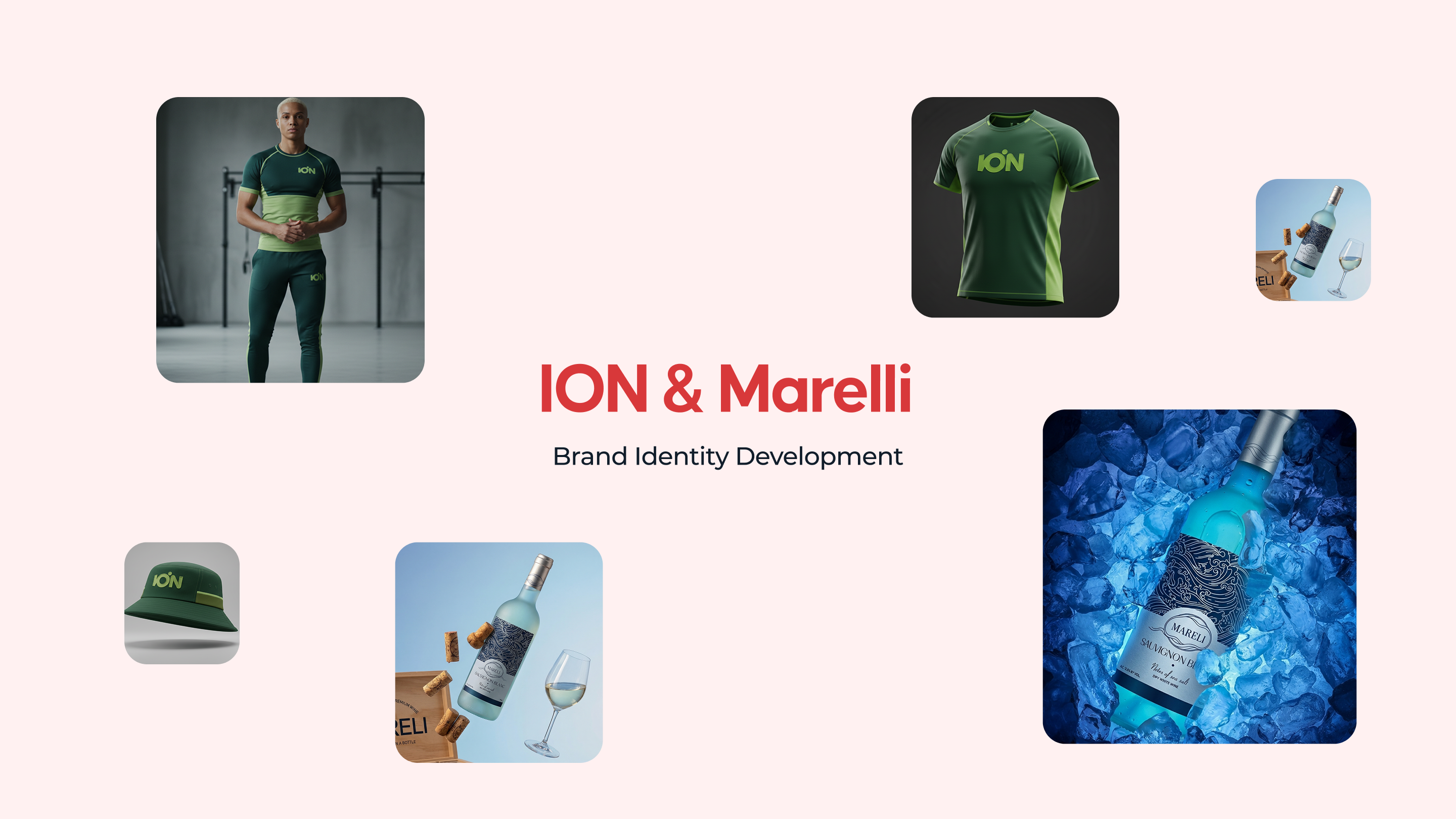
The system extends across the brand's full physical footprint: apparel (hoodies, tees), accessories (keyfobs, smartwatch interfaces), environmental signage, out-of-home placements, and social presence, each built to carry the tagline that anchors the brand: "For humans in motion."
Marelli – The Horizon in a Bottle
Where ION is kinetic, Marelli is still.
Marelli is a premium, boutique wine brand built on a dual-meaning name, "Beloved Sea" and "Bright Sea", and an identity concept we called Modern Horizon: a deliberate move away from the ornate, traditional crests common in wine branding, toward something quieter and more contemporary.
The primary logo is built around what we termed the Shoreline frame, an intentionally imperfect, hand-drawn oval inspired by a sea-weathered pebble, representing the brand's nurturing, organic core. Wave lines break the frame's boundary rather than staying contained within it, symbolising the limitless horizon the brand is named for. Internal interwoven currents echo the layered complexity of the wine itself.
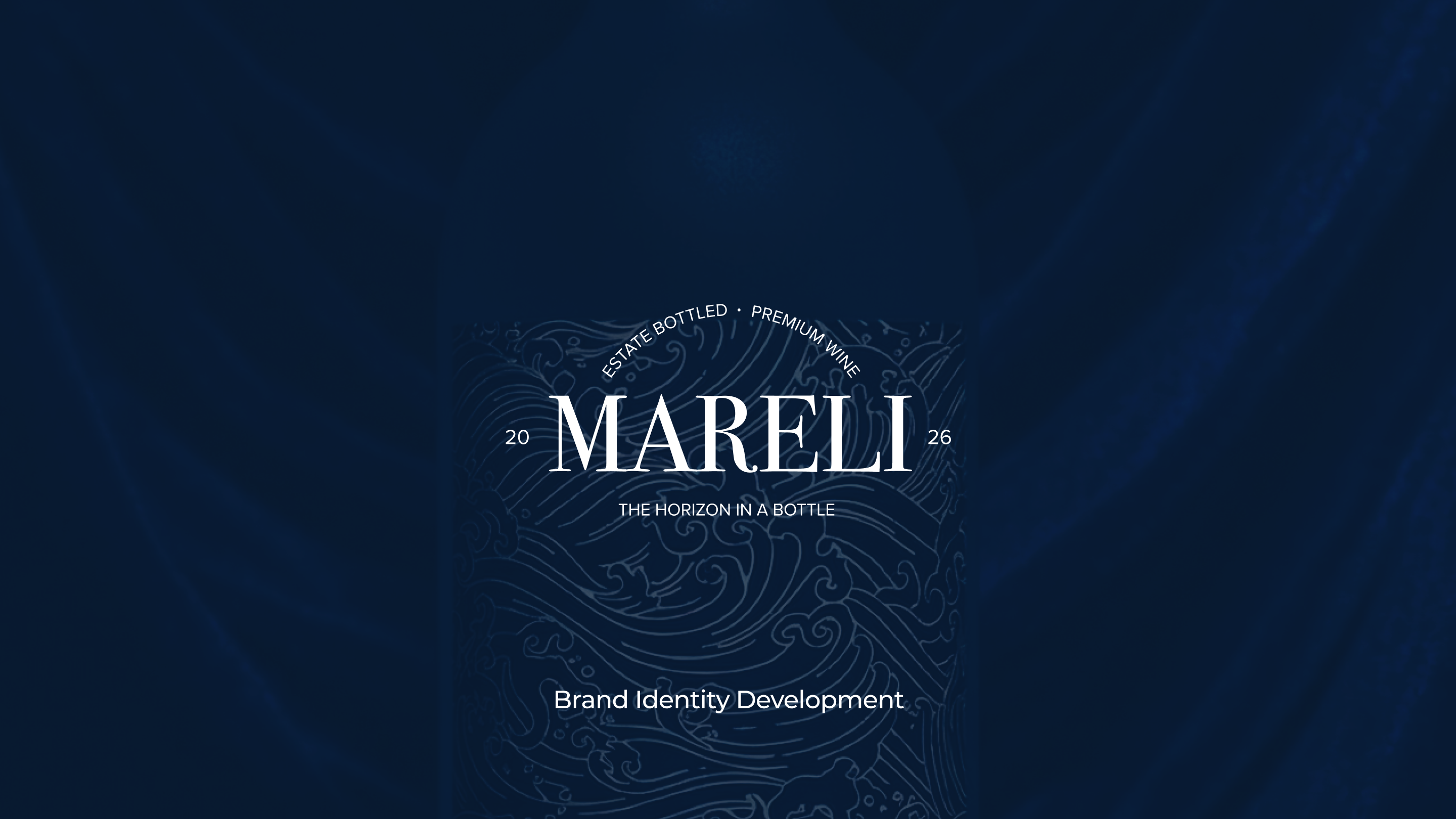
A secondary, more structured wordmark, paired with the line "Estate Bottled · Premium Wine" and the tagline "The Horizon in a Bottle", acts as a typographic guarantee of quality, balancing the organic primary mark with something more definitive.
The full system, including label design applied to an actual bottle mockup (Sauvignon Blanc, "Notes of sea salt"), demonstrates the identity working end-to-end, from concept sketch to shelf-ready product.
Why This Matters
Neither ION nor Marelli had a client brief constraining the outcome. That's exactly the point.
These projects show what CHILD's brand identity process looks like with full creative latitude, concept development, naming logic, logo construction, typography selection, colour systems, and applied execution across real-world touchpoints. It's the same excellence we bring to every client engagement.
At CHILD Creative Studio, brand identity is where everything begins, and where most brands get it wrong. ION and Marelli are proof that getting it right, from concept to touchpoint, changes everything about how a brand shows up in the world.
Your brand deserves that same foundation.